

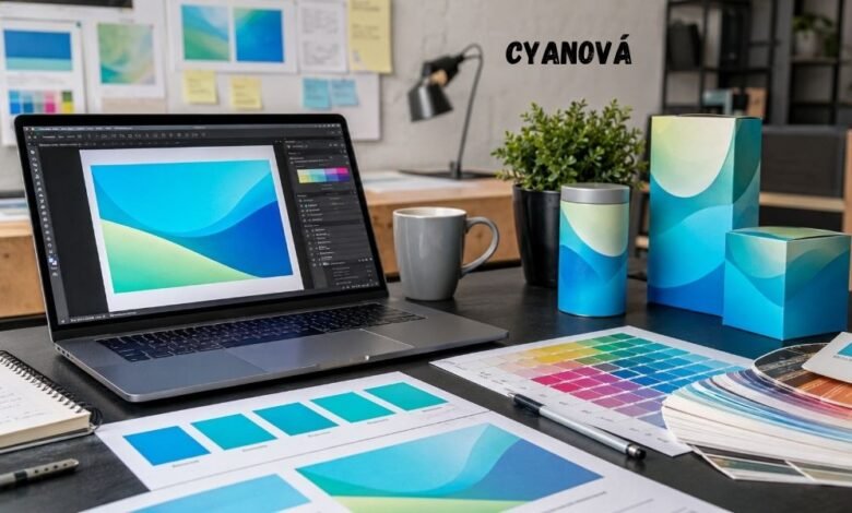
Cyanová can look bold, fresh, and clean on a screen. It has the bright feel of cyan and the calm feel of blue-green. That is why many designers like it for websites, social media posts, logos, product labels, and modern brand designs.
But there is one problem.
The same Cyanová shade may not look the same when it is printed.
A client may see a bright Cyanová design on a laptop and say, “Yes, that is perfect.” Then the final box, flyer, shirt, or brochure arrives. The color looks dull, darker, greener, or less sharp. The client feels disappointed. The designer feels stressed. The printer may say the file was not prepared correctly.
This is one of the most common problems in design. A color can look great on screen but change in print. Cyanová makes this problem more visible because it is a bright and vivid color. It often depends on light, screen settings, paper type, ink, fabric, and print method.
Cyanová is used online as a vivid cyan or blue-green color linked with design, branding, printing, fashion, photography, and interiors. But it is not one fixed official color code. That means designers should not use the name alone. They need exact color values and print tests before the final job.
The Client Who Loved the Laptop Version
Think about a small skincare brand. The owner wants new packaging. She wants the brand to feel clean, calm, and fresh. The designer makes a box design with a bright Cyanová background. On the laptop screen, it looks modern and expensive.
The client loves it right away.
Then the first printed sample arrives. The color is close, but not the same. It looks flatter. The bright glow is gone. The client asks, “Why does it not look like the screen?”
This is where the real design work begins.
A screen uses light. Print uses ink or pigment. A screen can show very bright colors because it shines color directly into the eye. Paper cannot shine. It reflects light. That alone can make a bright Cyanová shade look less alive on a printed item.
This does not mean the designer failed. It means the color moved from one world to another. Screen color and print color do not behave the same way.
Why Screens Make Cyanová Look Brighter
Most screens use RGB color. RGB means red, green, and blue light. These light colors mix together to create the colors we see on phones, tablets, laptops, and monitors.
This is why Cyanová can look so bright online. The screen is adding light. It can make blue-green colors look sharp, glowing, and almost electric.
Print is different.
Most full-color print work uses CMYK. CMYK means cyan, magenta, yellow, and black ink. Instead of adding light, print uses ink on a surface. The paper, card, plastic, cloth, or label material changes how the color appears.
Adobe explains that RGB is used for screen work, while CMYK is used for full-color print work such as brochures. Adobe also notes that software may convert CMYK images to RGB just to show them on screen. This means the screen preview is still only a preview, not a perfect print result.
This is why Cyanová can be tricky. The color may be easy to love on screen, but harder to match in print.
RGB vs CMYK: The Simple Difference
The easiest way to understand the problem is this:
RGB is made with light. CMYK is made with ink.
RGB can often show brighter and more glowing colors. CMYK has limits because ink and paper cannot always copy the same light-based effect.
For example, a bright Cyanová web banner may look clean and strong on a phone. But when that same design is used on a business card, the printed shade may look softer. It may lose part of its glow.
This matters for:
-
Logos
-
Business cards
-
Flyers
-
Product packaging
-
Stickers
-
Clothing prints
-
Posters
-
Book covers
-
Labels
-
Menus
A designer should not promise that Cyanová will print exactly like it appears on a screen. A better promise is this: the designer can make it look as close and as professional as possible by using proper color values, proofing, and testing.
Cyanová Is a Name, Not a Print Guarantee
One of the biggest mistakes is treating Cyanová as if it has one exact color value. It does not always work that way.
A person may say Cyanová and mean a bright cyan. Another person may mean turquoise. Another may mean teal. Another may mean a soft blue-green. On screen, these may all look close. In print, the differences become more serious.
That is why designers need more than a color name. They need color codes.
For digital work, they may use:
-
HEX
-
RGB
-
HSL
For print work, they may use:
-
CMYK
-
Pantone or spot color
-
ICC color profiles
-
Printer proof settings
This makes the work clearer. Instead of saying, “Make it Cyanová,” the designer can say, “Use this exact Cyanová value for web, and this tested CMYK version for print.”
That small step can prevent a big argument later.
The Hidden Role of Screens and Settings
Even before printing, Cyanová can look different from one screen to another. A phone may make it look bright. A cheap laptop may make it look dull. A high-end monitor may show it with more detail. A screen in night mode may make it warmer.
Brightness settings also matter. A color viewed at full brightness may look more powerful than the same color viewed on a dim screen.
This is why client approval can be risky when it is based only on one screen. The client may approve a color on a phone while standing near a window. Later, the same color may look different in a print shop, office, or store.
Professional designers often use calibrated monitors and color profiles to reduce this risk. ICC profiles are part of color management. The International Color Consortium says ICC profile formats support device-dependent and device-independent color spaces, including RGB and CMYK families.
In simple words, color profiles help devices understand color in a more controlled way.
Paper Can Change Cyanová More Than People Expect
Paper is not just a surface. It is part of the color result.
A Cyanová design printed on glossy paper may look sharper and brighter. The same design on matte paper may look softer. On recycled paper, it may look warmer or less clean. On textured paper, it may look uneven.
This is why print samples matter.
A designer can prepare a file correctly, but the paper can still change the final look. Ink spreads, dries, and reflects light in different ways on different materials.
For packaging, the problem can be even bigger. Cyanová may appear different on:
-
White cardboard
-
Brown kraft paper
-
Plastic labels
-
Clear stickers
-
Fabric tags
-
Foil surfaces
-
Coated boxes
A good print process should test Cyanová on the same material that will be used in the final product. A proof on plain office paper is not enough for premium packaging.
Fabric Makes the Problem Even Harder
Cyanová can be very hard to control on fabric. A design printed on a cotton shirt may not match the same design printed on a paper flyer. The fabric absorbs color. The weave of the fabric affects the surface. The base color of the shirt also changes the final result.
For example, Cyanová on a white shirt may look bright. On a cream shirt, it may look softer. On a dark shirt, it may need a white underbase before printing. Without that underbase, the color may lose its power.
This is why clothing brands should never approve Cyanová only from a digital mockup. A mockup can show placement and style, but it cannot fully show the real printed result.
The best step is to order a sample. It costs more at the start, but it can save money later. It is better to fix one test shirt than to reject 500 finished shirts.
Why Designers and Printers Sometimes Blame Each Other
Screen-to-print color problems often create tension.
The client blames the designer. The designer blames the printer. The printer blames the file. Everyone may be partly right.
The designer may have used a bright RGB Cyanová that cannot be matched well in CMYK. The printer may have used a different profile or machine setting. The client may have approved the color on an uncalibrated screen. The material may not support the same brightness.
This is why a professional workflow matters.
Before final printing, the designer should explain that color can shift. The printer should provide proof options. The client should approve a physical sample when color accuracy is important.
Good communication can stop the blame game.
A simple note can help:
“Colors on screen may look different in print. Final color depends on ink, material, lighting, printer settings, and proofing.”
That one sentence can protect both the designer and the client.
The Best Way to Use Cyanová in Brand Design
Cyanová can still be a powerful brand color. It can feel clean, modern, fresh, creative, and calm. It can work well for technology, wellness, beauty, travel, education, and design brands.
But it should be used with a clear system.
A brand guide should include:
-
Cyanová HEX value for websites
-
RGB value for digital graphics
-
CMYK value for print
-
Approved light and dark versions
-
Approved background colors
-
Text contrast rules
-
Print proof notes
-
Logo use rules
This gives the brand more control. It also helps future designers, printers, and marketing teams use the color correctly.
Without a guide, every person may choose a slightly different Cyanová shade. Over time, the brand can look messy. One flyer may look teal. One social post may look cyan. One package may look blue. A strong brand needs color discipline.
Cyanová and Readability Problems
Cyanová is not only a print problem. It can also cause readability problems online.
A bright Cyanová background with white text may look stylish. But it may not be easy for everyone to read. Some users may struggle with low contrast, bright light, small text, or vision differences.
The Web Content Accessibility Guidelines explain that normal text should have a contrast ratio of at least 4.5:1 for Level AA, with lower requirements for some large text.
This matters because a beautiful design can still fail if people cannot read it.
Designers should test Cyanová with:
-
White text
-
Black text
-
Dark blue text
-
Gray text
-
Button labels
-
Icons
-
Links
-
Small mobile text
A color should not only look good. It should help people use the design.
Practical Steps Before Printing Cyanová
Designers can avoid many Cyanová problems by using a careful process.
First, choose the exact digital color. Do not leave it as “Cyanová” only. Pick the HEX and RGB values.
Second, create a print version. Convert the design to CMYK using the correct print profile. Do not wait until the last minute.
Third, talk to the printer. Ask what profile, paper, ink, and proofing method they recommend.
Fourth, order a proof. A proof is a test print. It shows how the color may look before full production.
Fifth, check the proof under normal light. Do not judge it only under yellow indoor light or bright sunlight.
Sixth, adjust the color if needed. Sometimes the CMYK version needs small changes to stay close to the desired Cyanová look.
Seventh, save the final values in the brand guide. This helps keep future print jobs more consistent.
This process may sound slow, but it is cheaper than fixing a failed print run.
Final Thoughts
Cyanová is a beautiful color idea. It can make a design feel fresh, sharp, and modern. It can help a brand stand out. It can make a room, package, website, or logo feel more alive.
But Cyanová also shows one of the biggest truths in design: color is not fixed by a name alone.
A color on screen is not the same as a color in print. RGB and CMYK work in different ways. Screens, paper, ink, fabric, lighting, and profiles can all change the final result.
This is why designers should treat Cyanová with care. Use exact values. Make digital and print versions. Test the color before final production. Explain the limits to clients early.
When Cyanová is handled well, it can be more than a trendy color word. It can become a strong and reliable part of a brand’s visual identity.